Pivot is an online school established in New York in 2021 to help people to master a drastically new creative profession. Pivot educates by motivating and engaging in the community. The school’s program includes online courses, lectures, and fashion seminars.
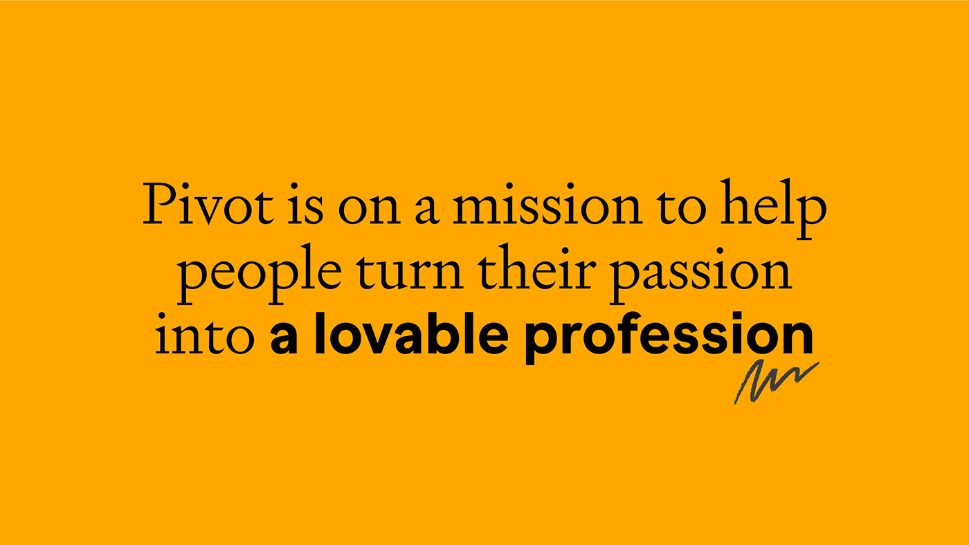
The brand identity metaphor is based on a lifelong learning thesis — be brave, keep dreaming, and dream hard. It’s never too late to change your career and life upside down.
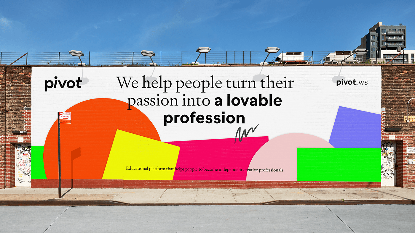
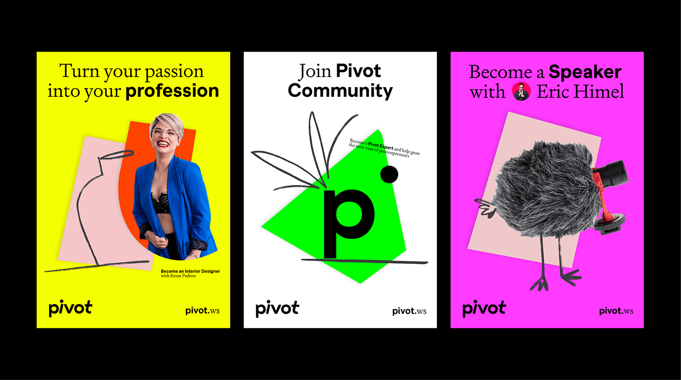
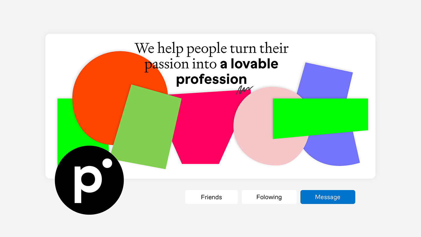
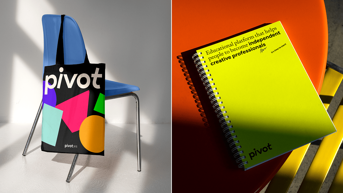
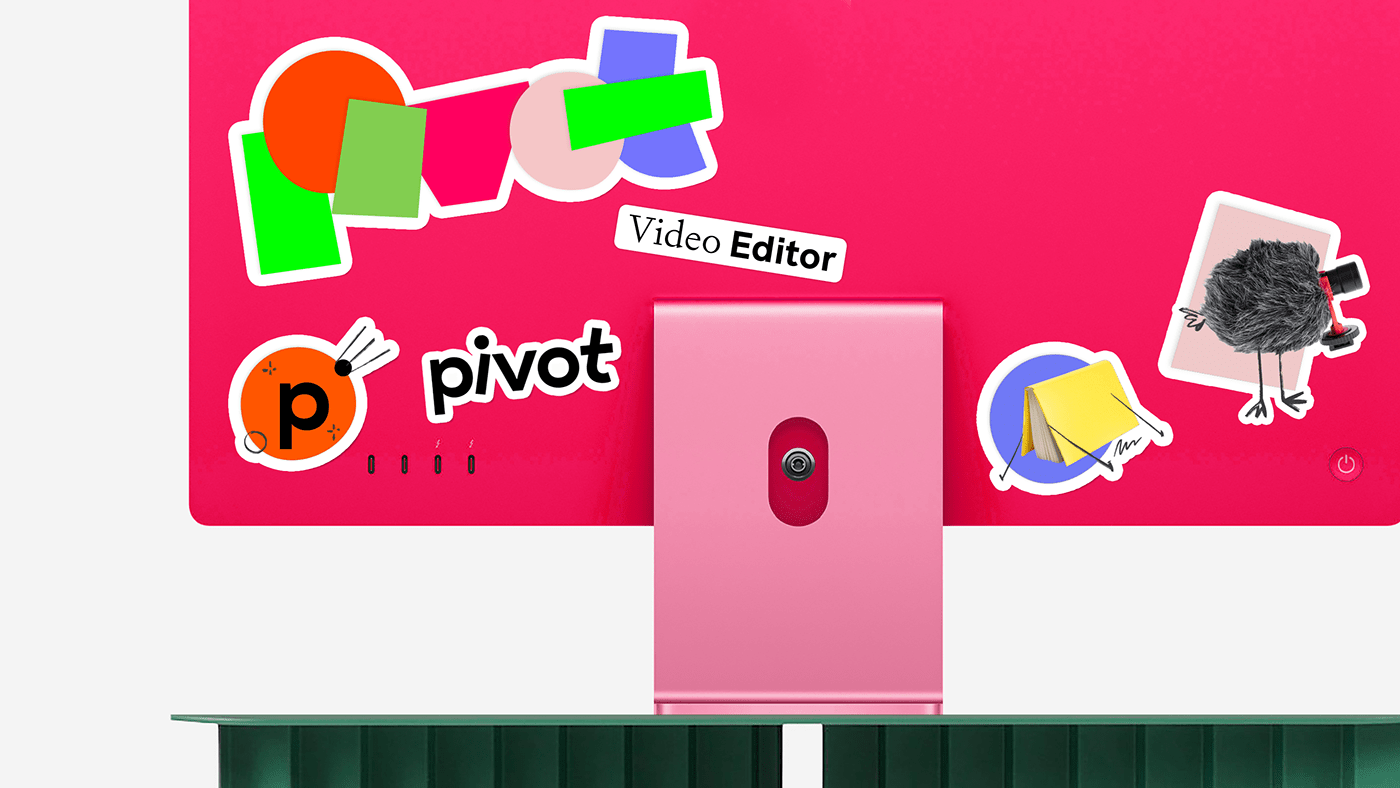
Eclectic and vibrant visual identity is a graphic interpretation of the “pivot” meaning and the motto “Turn your passion into the profession.” The dynamic logo transforms into a rough application, and its elements spread throughout the entire design system. Features of different geometry, thickness, style, and color combine like a collage — hand drawing, illustrations, portraits of teachers, subject photos, shadows, underlining and decorative typography of several fonts. Together it conveys the brand’s playful approach to education where curiosity, desire, and interest go first under a flag of lightness and feigned irresponsibility.
#shukadesign 2023


SHUKA
creative strategy director → anastasia butrym
creative director → ivan velichko
art director → daria zudina
lead designer → evgeny drozhzhev
designer → natalia radnaeva
illustrator → khadia ulumbekova
lead motion designer → dmitry kozlyaev
motion designer → arman angikov
motion & sound designer → daniil svetlov
project manager → anna eremina
stories department director → vasily kolesnik
stories department producer → ekaterina scherbakova
designed by shuka ®
© all rights reserved
© all rights reserved


